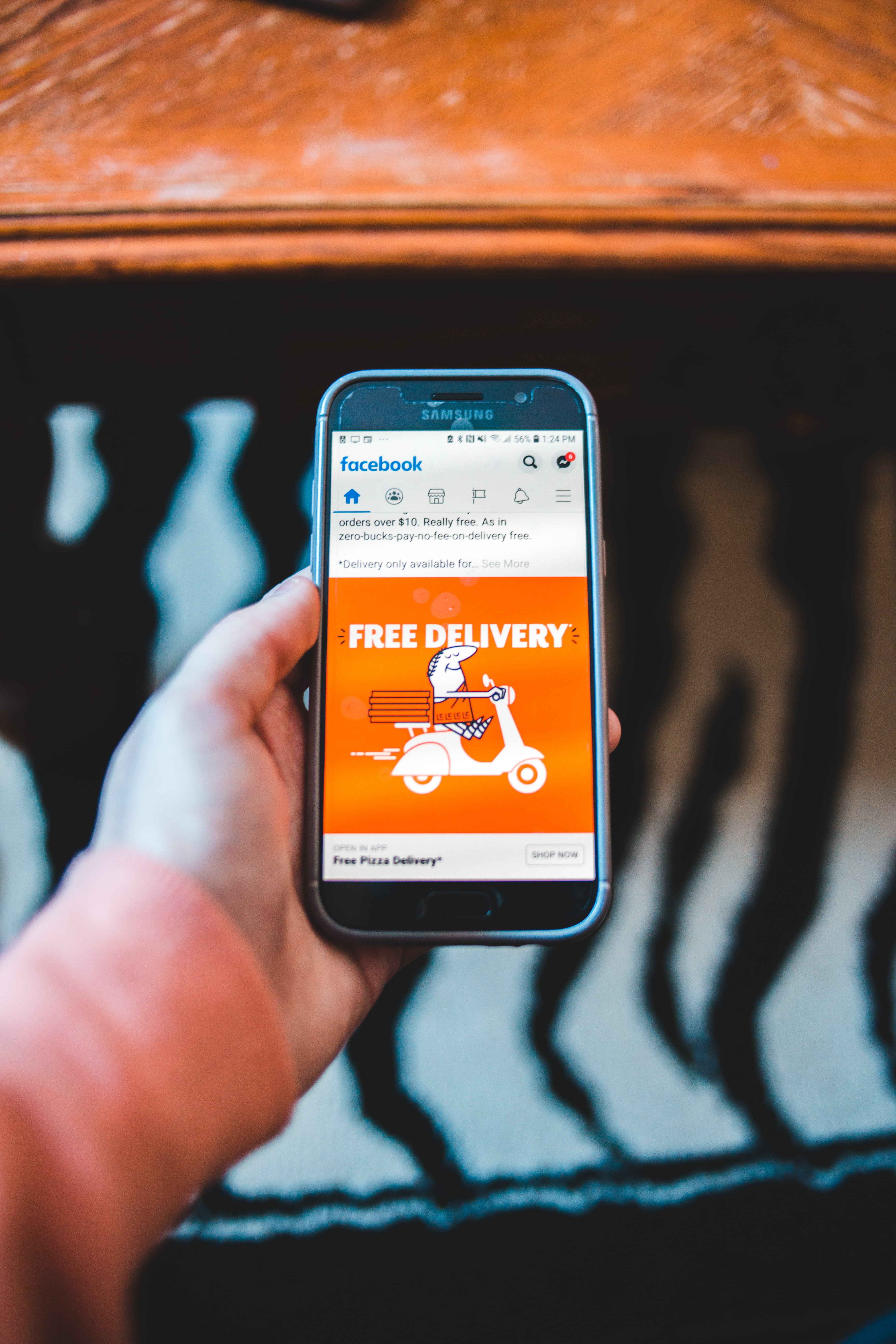
Digital advertising campaigns come at a cost, so you want your ads to be as prominent as possible from day 1.
You need to reach an ROI of at least 3:1, and to do that, your ad has to apply some design and content best practices.
The following are some sales-oriented tips for a compelling ad that will definitely generate more qualified traffic.
Enjoy!
1- Abide by the Focus Area
The Focus Area is where you look first when scrolling through social media, and that’s the center of the post. Have your most important message be close to the center of the post for a better chance to connect this message with the audience.
To measure the effect of this, you can A/B test with 2 designs, and your success metric will be link clicks.
For example, you can A/B test your ad with “buy for $100” at the center of the post vs having it at one of the corners. If the A design gets more clicks than the B design, it will be better to use the A design.
2- Respect the Whitespace
White space makes your ad easy on the eye. It will also let you better highlight the content that matters since the goal of the ad is to sell this message to the audience. You want it to have their full attention.
Use white space wherever possible, but include bright colors that would catch the audience’s attention while scrolling.
Put in your best efforts to make your ad not look like an ad since this is an anti-ad tactic that has proven itself successful in increasing website traffic.
3- Simple design is the best design
Don’t overdo your ad design. Go with something simple featuring the product, the brand, the price, and most importantly, the offer. Adding additional elements to the ad is nice, as long as it doesn’t distract the audience from your key message.
Below are some examples of the most usual ad mistakes you should avoid:
- Not enough white space or separation between elements.
- Overcrowded ads with too many fonts and colors compete against each other and clutter the design, making it harder for the consumer to read.
- Using too many words or visuals to describe your offer.
4- Mention the added value of the offer
Your audience always wants to 1- get a better deal, and 2- Get the deal that requires less effort to buy. This means that your ad should either feature a promo on the price, or a promo on the shopping service.
Promos on the price can be featured by either a discount (up to 80% off, use promo code 50OFF, Save 20% while shopping this month, etc…) or a giveaway while purchasing. The approaches here are endless.
Promos on services can be featured by providing free shipping, express shipping, free premium membership subscription, and more.
5- Use a call-to-action
Psychologically, people do what we ask them to do. This is why your ad should always have a Shop Now or Get Discount button embedded within the Focus Area of your ad.
Tell your people what to do, and if they are convinced… they will do it.
You don’t want to end up convincing them, and then they don’t know what they need to do to claim their product.
6 – Answer your customer’s concerns
There are many barriers that increase your shoppers’ buying journey. These could be your return policy, payment options, or shipping services.
Your ad has to answer these concerns so that you create a level of trust with your audience which will position your store as an easy-to-buy-from destination. This is one of the most important added values for any online store.
